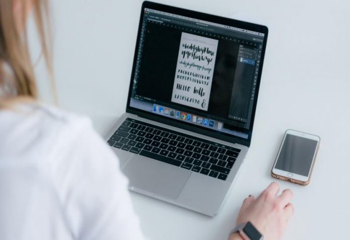
The number of mobile phone users is increasing exponentially and almost every user is accessing Internet on these devices. Owing to this trend, it has become incumbent upon every business to design their websites to render well on every device. As the maximum part of every website includes text, typography demands special attention.
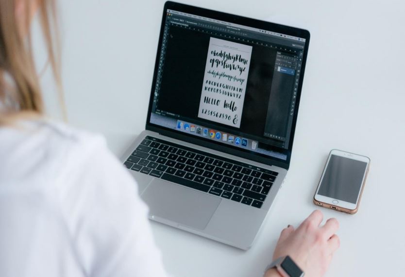
The technique that aids in formatting, styling, and arrangement of printed text is known as typography. In other words, it is the manner in which text is integrated into the websites. Most of the designers consider the business type and end users while choosing the typography of the websites.
Here’s an example that makes a creative use of the typography.

With that said, let’s delve deeper into the best practices for mobile web design.
1. Size of the Font
As a thumb rule, the font size should be at least 16px for mobile websites. It could lead to poor readability for visually challenged individuals if you choose a smaller size. Also, larger font size could make it tougher to read through the content.
According to Nielsen Norman Group, short strings of text warrant faster reading with better comprehension if they are written in all caps with regular lettering width and in 4mm size rather than 3mm.
Take a look at the opening line on Just Creative – All Caps and just perfectly readable.

2. Color and Contrast
Choosing the right colours is important when it comes to images, text and design elements of your website. Apart from the base color of the font, maintaining the contrast and the background is equally important.
Imagine a yellow background and white text written over it.
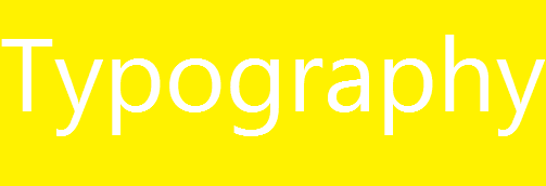
It is hardly visible, right?
We certainly do not want such an issue in the website design.
According to the Web Content Accessibility Guidelines, a contrast of 4.5:1 is the minimum contrast that you should have between the text and background so that you have good readability.
Exceptions to this rule are:
- If your text is 18-point or 14-point in bold, a contrast of 3 to 1 would work well.
- Only the text displayed in the active part of the web page has to adhere to this rule.
- A brand logo can have contrast according to the designer’s preference.
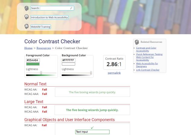
In case you are not able to decide the ratio between the color of the font and background, WebAIM can assist you.
Here’s a screenshot to explain you how it works.
3. Tracking
Simply put, tracking helps to control density in the mobile web design and adjusts spaces for the text block. A line should have upto 30-40 characters only and tracking helps to control this length without inserting any additional characters. It would not be properly readable if this rule is breached. Your tracking should be able to entice the readers to go through the text and then get“ convinced” to convert.
4. Leading
Neilsen Norman Group suggests that content placed above the fold on a desktop monitor of 30 inches is equal to five screenfuls on a small mobile device of 4 inches. This reflects the amount of effort a user has to put in for viewing the entire website.
See how Moby’s Trip has modified their website layout and typography to reduce the scrolls for the reader.
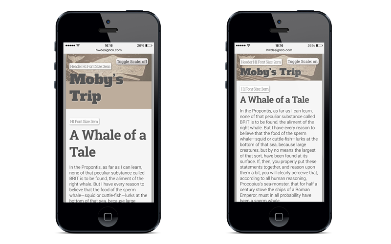
Source: https://typecast.com/blog/a-more-modern-scale-for-web-typography
As a best practice, you should create another version for mobile that imparts a smooth experience to all those users. According to WCAG, spacing between the lines should be 1.5 or 150%. Keep the spacing between paragraphs up to 2.5 or 250%.
5. Compatible Fonts
It is important to consider the typeface defaults for Android and Apple to understand the compatibility of fonts. For Google, it is Noto and Roboto. Roboto is the primary default font while Noto is the fallback font in case the website uses a language that does not support Roboto. Apple, on the other hand, works on typical guidelines set for iOS and the system type face is San Francisco. The beauty of this font is that it is a basic sans serif font and Apple does not recommend the usage of bold stylization or outlandish sizing, leading or tracking rules. That’s aid, it is always better to begin with a system default font. It is the safest bet for typography in mobile devices.
6. White Space
You should keep enough room for white space so that the website copy does not look like a wall of text. Quite often, it is observed that the mobile website tries to accommodate all the design elements such as background images, textures, any other content panels. This leads to a cluttered design on the mobile screens. To avoid this, you can do away with any color or texture in the body and reduce the margin outside the main content area. Just have a simple single margin and you will have enough white space to let your copy breathe.
Important Points to Consider for Typography in Mobile Devices
- It is strongly recommended that you use a sans serif or serif font. For desktop websites that use a fancy font, use traditional fonts for mobile devices. However, it does not imply that you should completely do away with fancy fonts. You can always have a few custom, non-traditional fonts that make your website visually attractive.
- Use a maximum of two typefaces for mobile devices. It would be visually disturbing to have too many fonts on the website. The two typefaces should complement each other. You should consider using faces that have the same character width. It is quite likely that every face has a unique and contrasting design, but you should try to maintain uniformity for mobile users.
- Refrain from using typefaces without distinct characters. The most common example is of the letter “i” in uppercase, the letter “l” in lowercase, and the number 1 put together. It can get pretty confusing to figure out what’s what. Same applies for the letter “o” and zero, and the letters “r” and “n” placed adjacent to each other like in the word “journey”. Your visitors are as busy as you are and therefore it becomes particularly important to ensure readability of the text.
- Arial, Courier New, Georgia, Verdana, Trebuchet MS, Tahoma, and Times New Roman are the most compatible fonts that display well on every device.
- Left side alignment is the safest bet when it comes to mobile typography. In case the copy has several lines, left aligned text looks the best. On the other hand, centred text looks good for the title and short copy.
In a Nutshell
Designing for mobile devices is all about details, functionality, and visual appeal. Following the above-mentioned tips and tricks will surely help you create a clear user interface and experience on a small screen without any flaws. If you have any other ideas for typography in mobile app development, we would love to hear from you.


